
Colour and concept
2027 Wedding Trends: Colours, Themes and Table Decorations
The thing that makes a wedding look current isn't using every new idea at once. A few decisions that speak to each other: a color that looks good in the right light, flowers that leave space on the table, a readable invitation, and a room where guests can move freely. If you're looking for inspiration for 2027, think about these together first.
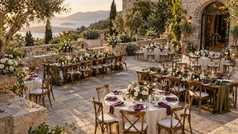
Let's put the distinction first: observed trend, future forecast and your choice
2027 hasn't started yet. Therefore, it would not be right to impose a color or flower by saying "everyone will choose this". A published trend report can bring together the search behavior and expert commentary of a particular market; That data does not show how many couples will use the same decoration throughout Turkey. An inspiration photo tells you that a single design is possible, not its prevalence.
Read this guide on three levels: aspects seen in international reports, matches we developed based on these and conditions you need to check in your place. For example, mentioning plum as one of the prominent colors is an observation. A suggestion is to combine it with off white and sage. How the fabric you choose will look in the light in the venue can only be understood with a real sample.
Make trends a screening tool, not an order list. Find what three images you like have in common: color, material, a more intimate seating feel? When you collect only the details from three dissimilar weddings, a coherent whole often does not emerge.
Color palette: distribute tasks instead of painting every surface
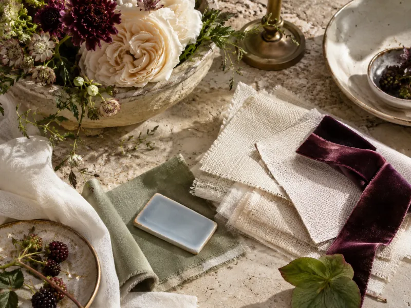
In 2027 color predictions, more saturated shades of burgundy, plum and green and counterparts such as powder blue are considered together. This doesn't mean you have to choose all the tablecloths darkly. The texture of the fabric, the surface it tablecloths and the ambient light are sometimes more decisive than the color name. The same plum, deep on a velvet napkin; it can look much more lively on a shiny satin chair.
Choose a main background, a supporting shade and a small accent. If the venue already provides the base colour, do not try to recreate it. In a room with cream walls, a tablecloth can continue that base while napkins and stationery provide colour. Outdoor olive trees may already supply the green in your palette.
| Match | Main usage | Caution point |
|---|---|---|
| Off-white, plum, sage | Open tablecloth; plum napkin; green textures | Try the dark color in night light without spreading it over all surfaces. |
| Cream, powder blue, silver | Blue paper detail and subtle metal touch | See if cold light turns blue to grey. |
| Stone, olive green, soft yellow | Natural finishes and small yellow accents | Do not add large artificial leaves that compete with the venue's greenery. |
| Ecru, dried rose, dark brown | Linen, ceramics and a small amount of bold text | Check on the small screen that the text is readable on the background. |
| White, coastal blue, lemon yellow | Striped fabric and low ceramics | Think of yellow as a decor object separate from the food presentation. |
Place the cloth, napkin, and printed card together at the same time before deciding. The two color chips on the phone screen do not guarantee that the real fabrics will match. Take your photo separately in daylight and in the lighting that will be used at the event; if you like one but are uncomfortable with the other, use it on a smaller surface.
One kind of flower: simple appearance, careful placement
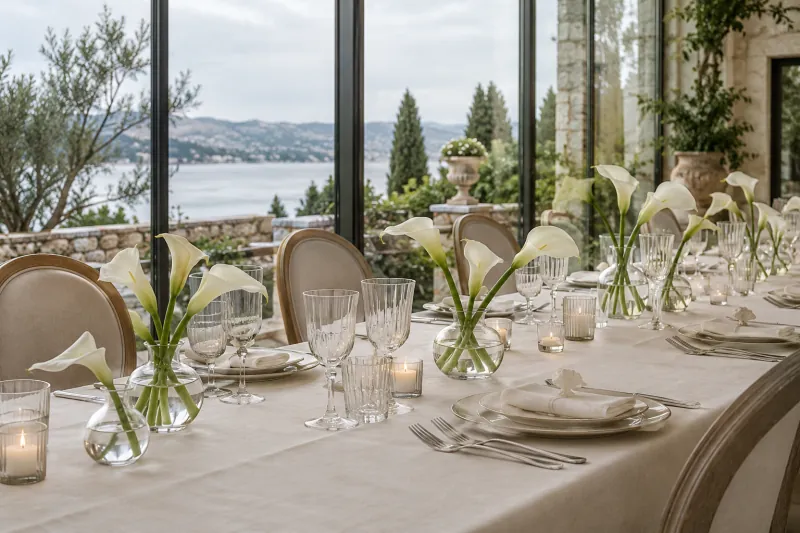
Single-variety arrangements appear in 2027 forecasts. Their effect comes not just from flower quantity but from repeating a form across the table. A few calla lilies, tulips or roses in one colour, divided between coordinated vases of different heights, can create a more distributed rhythm than one large centrepiece.
The first question is not 'how many stems?' but 'what else must the table hold?' Shared dishes, water, bread, menus and service all need space, so you do not have to fill the centre completely. Arrange vases with room to place a tray. Keep the space shown in photographs consistent with what guests will actually use during dinner.
Choosing one type does not automatically mean cheap or easy maintenance. Talk to the florist about supply, degree of opening, handling conditions and suitable alternatives on the wedding date. On the actual sample you receive, check how the stem fits into the vase and whether the water touches the fabric. If necessary, set up a trial with two smaller vases; then make your decision for all the tables.
Old texture, new use: lace and silver tones
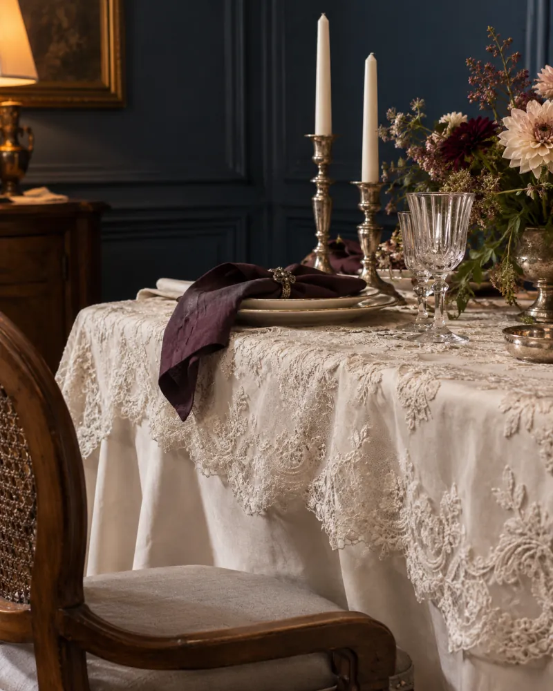
Lace and silver-toned objects are among the materials reinterpreted in international 2027 reports. Completely imitating an old invitation isn't the only way to use them. A narrow piece of lace on a plain veil or a single metal detail next to contemporary plates can give different texture without creating the appearance of a period costume.
If you are going to use an object inherited from the family, first look at its material and condition. Do not judge whether it is suitable for food to be placed on it by its appearance alone. Do not place delicate fabric near candles, drinks or sharp edges. It is not necessary for a piece of high souvenir value to be reproduced on every table; it can find a place at the couple's table or in the reception corner.
A silver candelabra does not behave the same as a shiny chrome menu holder. Test the reflection in evening light to see if the table number is rendered unreadable by glare. If you're considering real candles, ask about the venue's open flame policy; if there is no permission, decide with the organization team for a suitable alternative. Appreciating the decor does not replace technical rules.
Mediterranean interpretation: fabric and light before the seashell
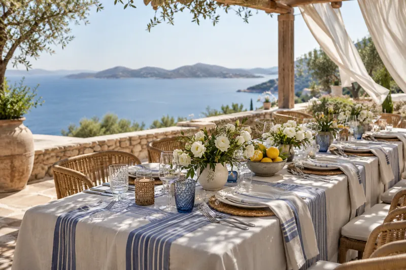
Coastal-inspired design doesn't mean putting all the nautical symbols on a table. In our suggestion, a light floor, restrained blue lines, ceramics and small yellow touches are sufficient. On a seaside terrace, the surrounding fabric is already strong; instead of covering that view with a new theme, you can complete it with a few details.
You can carry this idea to a venue far from the sea, but do not ignore the fixed elements of the space. A room with intense gold chandeliers, burgundy carpet and dark wood will not produce the same result as a photo of a white-blue terrace. Instead of transforming the room from scratch, it may be more consistent to use the line in the paper design and the light color in the flower.
Menus blowing away, unstable vases and fabric gathering on the ground may not show in a photograph. Include wind in the design of your table setting. Check how stationery and tablecloth edges will be secured and keep service routes clear. A sunny photograph does not mean the same corner will be shaded at your wedding time.
Table composition: space is also part of the design
When evaluating a table, first make it livable, then decorate it. Think about the order of the cloth, plate, glass, name tag and flower in front of the guest, not the order in the photo. When a person sits down, where will he put his elbow, how will he take the menu, from what distance will he see the other person?
Instead of a single large center on the round table, you can try a layout that leaves useful space around it. On a long rectangular table, repeating the same object frequently does not always produce neater results; interruptions required for service. Just because the center looks wide on a square table does not mean it is accessible from all four sides. Table size and chair allowance guide That's why it's useful to start with distinctions.
- Keep a table number visible. Do not place a large flower or reflective object in front of it.
- Check conversation line. Sit in an actual chair instead of just standing and staring.
- Reserve service area. In a scenario where plates are changed, will it be necessary to remove vases repeatedly?
- Consider cables and heat sources separately from the table. Leave the technical installation decision to the authorized team.
For starter account compare number of tables and space. This is not a capacity confirmation, but a step to prepare the questions you will ask in the interview. A visually spacious drawing does not verify the permitted use of space or actual service distances.
Guest experience: the decor is nice, so how will the day go?
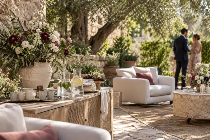
In current international editorial studies, personal preferences and the guest's experience during the day are also considered as part of the design. The local interpretation of this is not necessarily an expensive show. Finding your way at the entrance, seeing a place to sit while waiting, finding a corner where you can talk while playing music, or knowing where to get water also changes the feeling of the invitation.
If you plan a photo corner, check whether it will cause queues at the entrance. For a coffee station, decide when it will operate and who will run it, not just the counter colour. With guests of different ages, do not base the whole experience on everyone using a phone.
When your named location is ready the 'Where is my table?' QR feature you can use it as an auxiliary option at the entrance. The team should also have an up-to-date PDF list for the guest who cannot get the code or does not use a phone. Old code does not automatically refresh when the layout changes; you need to generate new QR.
On the music side, instead of leaving the whole night to one long list divide into sections such as introduction, first dance and cake. Discuss notes separately with the DJ, such as where a song will begin. Creating a list in the tool does not automatically adjust the venue's sound system or playback permissions on the platform.
Let the invitation, name tag and menu speak the same language
You don't need to use the same image on every sheet to make the decor look consistent. A single font family, similar spacing, and a small repeating color may be sufficient. After the floral invitation, the table number prepared in a completely different language creates a disconnect that the eye notices but sometimes cannot name.
Separate the information that actually needs to be read first: names, date, time, location, and orientation. Don't let decoration get in the way of these. Text with very thin lines may look elegant on the big screen but get lost in the small preview in the messaging app. Send the image to your phone and open it there once; see what information you can read without magnifying it.
In Invitation Studio you can select the background and change the font, color and location of the ornaments. You can also prepare a name tag, table number, menu and welcome board from the same design. When importing names from the saved seating plan, check the preview and confirm the transfer; Prevent spelling errors from multiplying across all editions.
Set up a table before ordering
Rather than expanding your inspiration folder, do a small trial. Before buying or hiring in bulk, ask the supplier to show you a full-size sample table. Sending a photograph and asking for an exact copy may not explain which detail you cannot do without.
- Choose two directions. Keep two compatible design aspects, not all the photos you like.
- Separate material. Write the actual fabric, flower type, vase and table shape in separate headings.
- Sit on the real chair. Try visibility and reach with plates, glasses and flowers.
- Look in the evening light. Check the tone you like during the day, also under the lighting it will be used in.
- Match offer with recipe. Are the quantity, size, installation, transportation and collection scope the same?
- Print alternative. If flowers or fabric cannot be found, for which change will you be asked for approval?
- Keep final version. Keep sample photo and agreed upon details in the same file.
The best decision for 2027 doesn't have to be the top option on a report. You just need to create a whole that works for your space, fits your budget, and that you still love when you look back. A texture or small color detail from the trend can do the trick without turning the whole wedding into something else.
Frequently asked questions
Which color will definitely be in fashion at weddings in 2027?
It would not be accurate to name one definitive colour. Published international forecasts combine saturated and softer shades. These are not completed-season data for Türkiye; treat them as inspiration to test in your own space and lighting.
Do dark colors necessarily make a small venue look cramped?
The result is not about colour alone. Surface area, lighting, table layout and fixed décor all affect it. Try a dark shade in a small detail and view it in the actual venue.
Would it be more economical to use a single type of flower?
Not always. Type, supply date, quantity, vase and installation cost vary. Get an offer for the same size and scope of delivery; ask what the alternative flower would be.
Does the workshop replace the real fabric and flower sample?
No. The workshop is to visually compare the table shape with the colors of flowers, linens and chairs. Actual material, color, size and supply require sample and vendor confirmation.
Where should I start when deciding on decor?
Clarify the space and habitable layout first. Then choose two color directions and try fabric, flowers and paper together on a table. Don't keep the decoration covering the layout just because it looks good in the photo.